À propos du projet
Kipful offre des cartes de visite NFC, des cartes innovantes qui permettent le partage d'informations de contact et bien plus, simplement en scannant la carte avec un smartphone. Déjà bien établie, la société Kipful visait à moderniser son site web et à optimiser le taux de conversion grâce à une refonte minutieuse du parcours d'achat, destinée tant aux entreprises de plus de 10 salariés qu'aux entrepreneurs indépendants.
EXPERTISES
Direction artistique
User Research
Product design
Product management

Les problèmes adressés
L'interface du site, dépassée, ne reflétait pas l'image technologique et premium que Kipful souhaitait incarner. De surcroît, le processus d'achat ou de demande de devis se révélait complexe et long, entravant la clarté des fonctionnalités pour les utilisateurs et contribuant à un taux de rebond significatif.
La présentation des fonctionnalités souffre d'un manque de clarté, ce qui mène à une mauvaise compréhension de l'étendue des possibilités offertes par le produit.
L'esthétique de l'interface ne reflétait pas le caractère haut de gamme que Kipful aspire à incarner. Ce décalage risquait de ne pas résonner avec la clientèle visée, qui pourrait alors quitter le site.
La complexité et la longueur du parcours d'achat, marquées par un nombre excessif de clics, contribuent significativement à l'augmentation du taux de rebond.
Les utilisateurs, confrontés à un excès de contenu textuel, risquent de se sentir submergés et peuvent être incités à quitter le site. Cette profusion de texte dilue l'impact des messages clés et entrave la fluidité de la navigation.


Les enjeux du projet
Présenter une esthétique alignée avec l'image haut de gamme de la marque, simplifier le parcours d'achat pour réduire le taux de rebond, optimiser la communication des fonctionnalités pour une meilleure compréhension des produits, et minimiser la surcharge textuelle pour éviter de submerger les utilisateurs et faciliter la navigation.
Minimiser les étapes superflues et optimiser la navigation pour encourager une progression fluide et intuitive à travers le site améliorant ainsi l’engagement des utilisateurs.
Prioriser l'alignement du design avec les valeurs haut de gamme de la marque, en veillant à créer une expérience visuelle qui résonne avec les attentes de la cible.
Repenser la stratégie de communication des fonctionnalités pour la rendre plus intuitive et accessible. Adopter une approche plus didactique dans la présentation des fonctionnalités.
Optimiser le contenu pour qu'il soit plus concis et structuré, en mettant l'accent sur la hiérarchisation de l'information et l'utilisation d'éléments visuels pour alléger la lecture.


Les solutions apportées
Kipful veut franchir une nouvelle étape dans son entreprise. Pour ce faire, nous avons ajusté leur identité de marque et revu l'ensemble de leurs parcours en ligne selon les nouveaux standards du web, en intégrant des logiques de funnel de conversion plus avancées et une meilleure structuration des offres.
Optimisation de la visualisation des produits, permettant aux utilisateurs d'accéder rapidement à l'information. Parcours d'achat considérablement simplifié : nous l'avons réduit à deux étapes claires avant d'atteindre le processus de paiement.
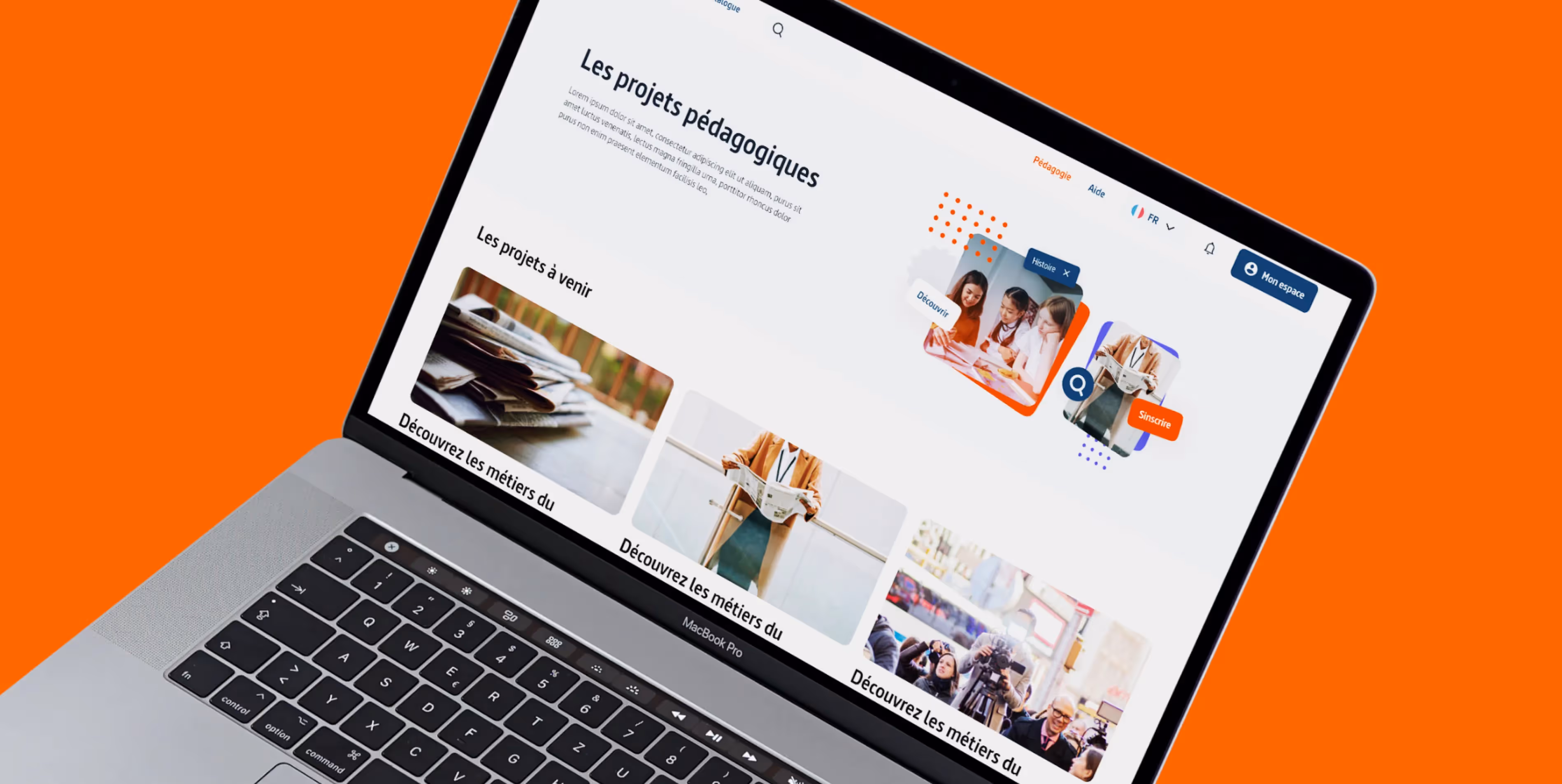
Une interface sombre et moderne, fusionnant éléments technologiques et esthétique haut de gamme, afin d'aligner l'image de marque avec les attentes de la cible Kipful.
Nous avons mis l'accent sur une structuration claire de l'information, en privilégiant l'utilisation de termes simples dans une démarche pédagogique. Cette approche est complétée par l'intégration de visuels et animations explicites.
Nous avons diminué la densité du texte en privilégiant des messages clairs et concis, accompagnés de visuels évocateurs. Cette approche favorise une compréhension rapide et efficace de la part des utilisateurs.

La méthodologie du projet
Le projet Kipful a été exécuté en suivant une méthodologie basée sur un design sprint, ce qui a permis de diviser de manière méthodique les différentes étapes clés en segments bien définis. Cette approche structurée a favorisé une gestion efficace du projet tout en mettant l'accent sur la réalisation des objectifs spécifiques à chaque étape.
Analyse et test des principes établie par la concurrence direct et indirect.
Identification, analyse et définition des différents problèmes à résoudre au sein des interfaces, parcours.
Création des premiers écrans de principe en nuance de gris afin de débuter la création des maquettes.
Application de la couche graphique sur les interfaces sur les wireframes précédemment réalisés.

Les compétences des équipes
Une équipe dédiée composée majoritairement de designers a été sollicité pour réaliser ces différentes missions.
Positionnements des offres et de la nouvelle direction
Conception de maquettes des différents parcours.
Mise en place de l’esthétique de l’interface du site web.
Conception de norme pour créer des composants développable
L'accompagnement du projet


Market Fit


Define
Définir et valider rapidement une idée.
Launch
Créer et lancer le MVP de son produit avec une démarche centré utilisateur, pour tester sa valeur avec un minimum de budget.
Boost
Valider l’adéquation entre le produit et son marché en itérant rapidement les fonctionnalités. Refondre son produit pour optimiser son fonctionnement.
Un site adaptée à l’offre
Kipful, synonyme d'innovation et de qualité pour entreprises et entrepreneurs, a vu son site transformé pour mieux refléter son image premium. En se concentrant sur une expérience utilisateur fluide et intuitive, nous avons revalorisé la plateforme, améliorant ainsi nettement le taux de conversion et réduisant le taux de rebond. Ce renouveau digital illustre l'importance d'une synergie entre design et fonctionnalité pour répondre aux exigences d'un marché exigeant, marquant un succès notable pour Kipful dans son engagement à offrir une valeur ajoutée à ses utilisateurs.